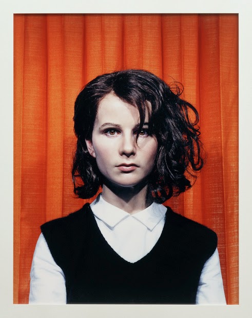
Tuesday, November 11, 2014

Gillian Wearing

Gillian Wearing

Key Image:


Compound Words:
Simply-bold
Subtly-dramatic
Naturally-vibrant
Seriously-strong
Statically-stimulating
Honestly-meaningful

Quotes:

"Wearing creates a powerful discrepancy between the public and the private"
"I am interested in collaboration, in people having a voice, there are so many different things to be said and learned by listening to as many people as possible"
"Wearing is one of the most interesting British artists of her generation"

Title Ideas:

Publicizing Privacy
Give Them A Mask, and They Will Tell The Truth
People Revealed One Mask at a Time
Masks of Honesty (or Comfort)
Exposing Society
Photography Can Be Strikingly Honest

Links:

http://www.maureenpaley.com/artists/gillian-wearing/biography
http://www.newyorker.com/culture/photo-booth/picture-desk-gillian-wearing
http://www.tanyabonakdargallery.com/artists/gillian-wearing/series-photography-and-video

Gillian Wearing was born in Birmingham. She attended Dartmouth High School in Great Barr, Birmingham. She went to study art at the Chelsea College of Art. Wearing made a film called Drunk in 2000, which is about 4 drunk men staggering around a studio. Wearing lives and works in London. She married British artist Michael Landy in 2010.


Sunday, October 26, 2014

Neville Brody Video

Gerard Unger - http://www.gerardunger.com/biography/biography.html


Unger studies graphic design and typography. He is currently a professor at the University of Reading. He has created many type faces and also creates logos, magazine covers, newspapers, books, and stamps.


Barry Deck - http://www.identifont.com/show?1HV


Barry Deck is a typeface designer from Iowa. In 1992 he became very involved with the typeface community when he moved to New York. Three years later he set up his own company and has worked with companies such as Pepsi.


Paul Elliman - http://www.peterbilak.com/graphic_design_in_the_white_cube/elliman.html


Elliman is a London based designer explores mutual interests of technology and language. He has many works on display at different exhibits. He is currently an art critic at the University of Yale School of Art.


Rick Vermeulen - http://www.eyemagazine.com/feature/article/reputations-rick-vermeulen


Rick was born in 1950 in the Netherlands. He studied graphic design at Rotterdam Academy. In recent years Rick has designed two typefaces for FUSE and works on other freelance projects as well.


Phil Bicker - http://life.time.com/author/philbicker/


Phil Bicker, who joined TIME in 2010, curates LightBox: The 10 Best Pictures of the Week for the iPad edition and contributes as a photo editor to TIME and TIME.com. Before working as a senior photo editor, Phil was an art director, starting at the Face magazine in London.


Tobias Frere-Jones - http://en.wikipedia.org/wiki/Tobias_Frere-Jones


Tobias Frere-Jones is an American type designer who works in New York City. He was formerly a partner with designer Jonathan Hoefler at Hoefler & Frere-Jones, a type foundry in lower Manhattan. Frere-Jones teaches typeface design at the Yale School of Art MFA program.

Tuesday, October 14, 2014

Typeface Research

Archer - Designed in 2001

- Serif (Slab Serif)


- Designers are Tobias Frere-Jones and Jonathan Hoefler


  • They created other typefaces such as Surveyor, MSL Gothic, Nobel, Gotham, Interstate

- Family members include bold, book, light, medium, italic, and semibold.


Old style is the idea of adhering to manuscript models in type design.

Slab Serif is a type of serif typeface characterized by thick, block-like serifs. 

A sans serif (without serif) is one that does not have the small projecting features called "serifs" at the end of strokes.


The stroke weight is used to describe the thickness of a line that helps make up a character in a font.


Small capitals are designed to match the x-height of lowercase letters.

An imaginary line drawn from top to bottom of a glyph bisecting the upper and lower strokes is the axis
A typeface that exhibits a change in the thickness of curved strokes, the inclination of the axis of the lowercase o is used to measure the angle of stress
Lining figures are a modern style of numerals where all figures are of the same height and rest on the baseline. Non lining figures do the opposite.
ligature occurs where two or more graphemes or letters are joined as a single glyph.

Type Measurement:

Type is measured by points from baseline to baseline when set without any extra space being added between the lines. A type with a different visual size both take up the same depth from line to line.

Wednesday, September 17, 2014

5 Dead Designers

Paul Rand is in American graphic designer. He was very famous for the logos he created such as Ford, UPS, and ABC. He is one of the most iconic designers of all time. He passed away November of 1996.


Max Huber is a Swiss graphic designer. He became very popular with his iconic and very influential designs. He created many record covers and magazines. Huber passed away in 1992.


Emil Ruder is a Swiss typographer and graphic designerHe is well known in the field of typography for creating an approach to designing and teaching that involved philosophy, theory and methodology. He passed away in March of 1970.


Max Bill was a Swiss architect, artist, typeface, and graphic designer. He worked on many architectural designs, then later went on to design his own house. He passed away in December of 1994.


Robert Massin became a designer around the time of World War II. He was a huge influence on French Design. He features in many French design books today.


Sunday, September 7, 2014

5 Designers

Erik Spiekermann is a German typographer and designer who created fonts in his letterpress printing press in his house. He is now a professor at a University.


Matthew Carter is son of Harry Carter. He is a typeface designer and is most famous for creating the Verdana and Georgia fonts.


Wim Crouwel is a Dutch graphic designer and typographer who created the font New Alphabet.


Stefan Sagmeister is a graphic designer and type artist. He owns his own firm called Sagmeister and Walsh Inc.


Jessica Hische is a professional letterer, illustrator and typographer. She also creates advertisements, books, and editorials. 


Who is Frutiger? Why is Univers Unique? Grid?

Adrian Frutiger is a very famous typeface designer who created the Univers font, as well as many others. You can find many of his typefaces in his home country of Switzerland located on roadsigns. He has also won many awards in the graphic arts departments.

His Univers grid is a chart that visually shows the ways in which the font can be manipulated according to stroke, weight, and kerning. This typeface is unique in that it shows a special sans serif with a nice height and an even weight. All together it, it a wonderful easy to read font.